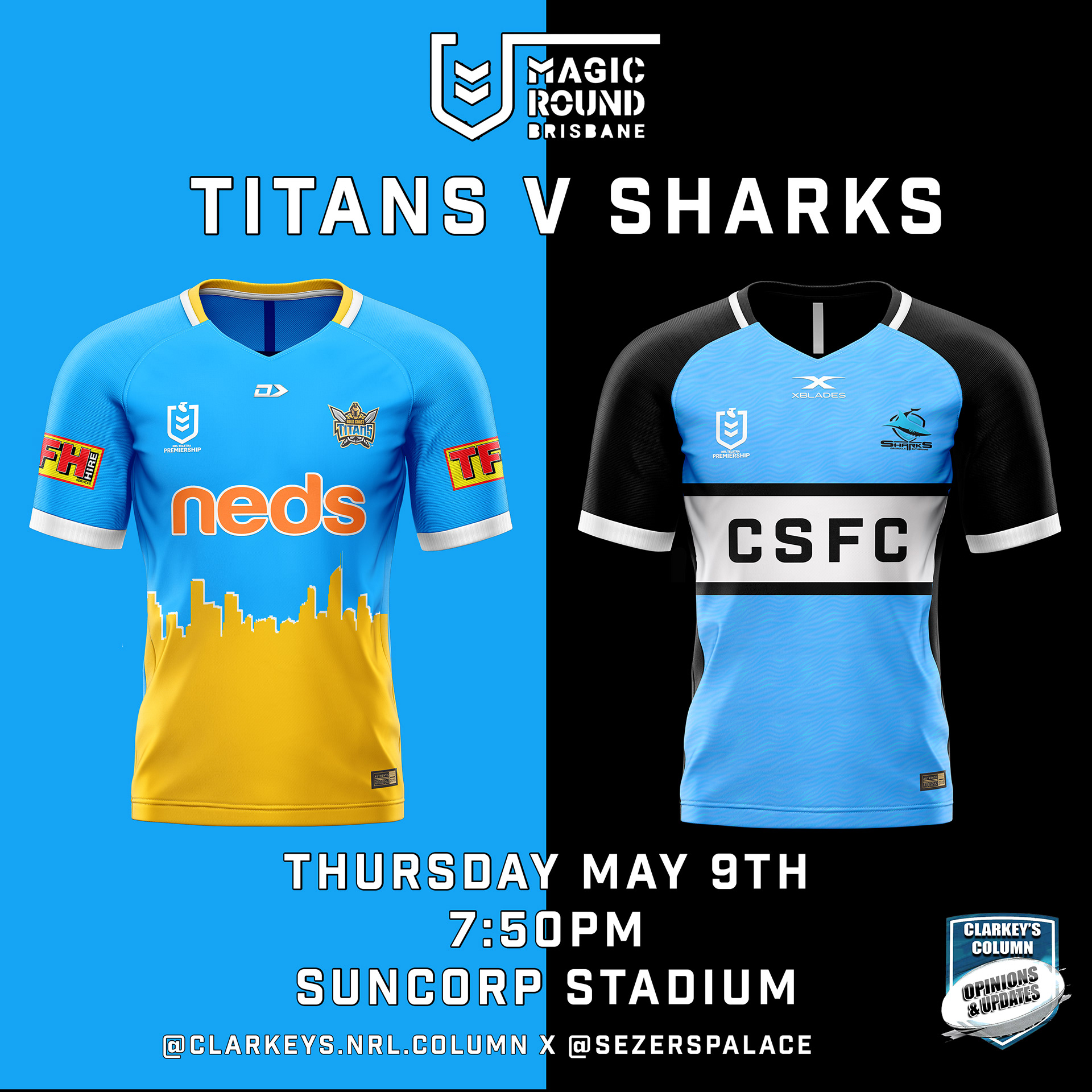
Titans: Revert back to original 2007 colour scheme. Implement Gold Coast skyline silhouette featuring sand + sky design elements.
Sharks: Twist on their classic home jersey. Water ripple effect on the front, black sleeves and back of jersey.
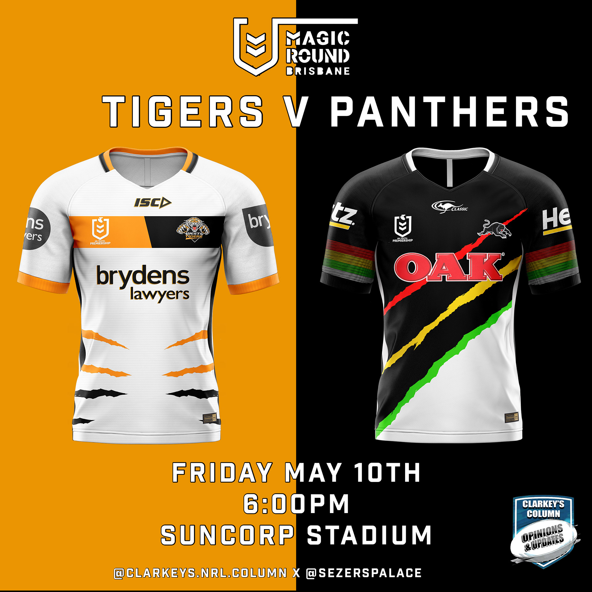
Tigers: Inspiration taken from the 2010 Wests Tigers design, however the side panels have been changed to tiger scratches. Wanted to attempt a white Tigers jersey as I feel as though they have been done poorly in previous years.
Panthers: Wanted to stick with the liquorice-all-sorts style as Phil Gould has openly stated that he wants to stick with this identity. Red/yellow/green stripes have been altered to mirror panther scratches.

Sea Eagles; Recreation of my favourite Manly Sea Eagles jersey, their 1996 'Pepsi' jersey. This jersey is always received positively when its brought back and it is not done often enough!
Broncos: A gold recreation of the polarising 90's Broncos 'diamond' jersey. Definitely one of the more polarising designs of this series.

Bulldogs: Found it incredibly difficult to modernise the classic 'V' design that the Bulldogs wear. Inspiration for the inverted V came from the Toronto Raptors "We The North" Series.
Knights: Redesigned "Barcelona stripes" jersey. Blue stripes are designed to look as if they have been painted on.
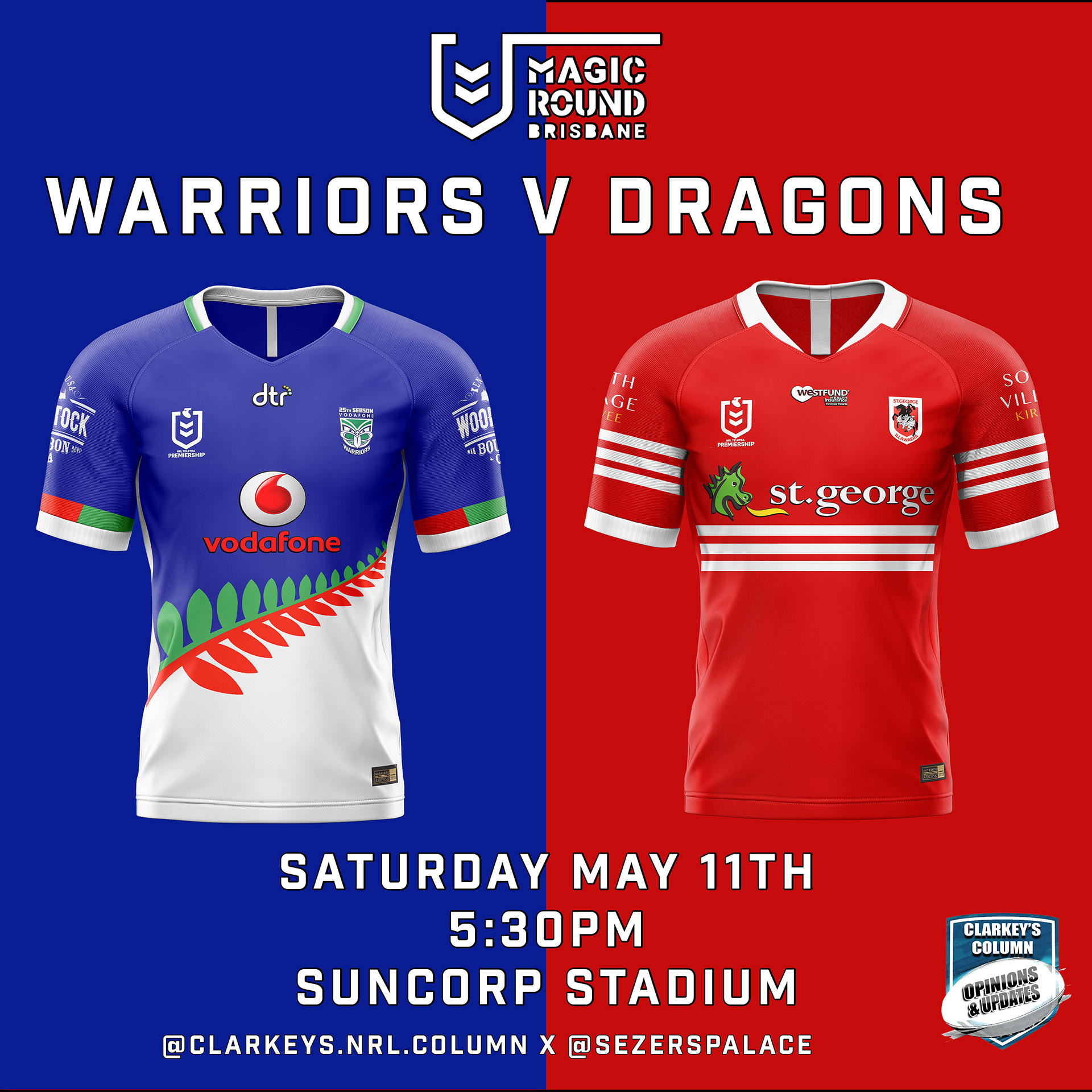
Warriors: 25 year anniversary colours, fern implementation.
Dragons: Steelers throwback jersey. This should almost permanently be their away.
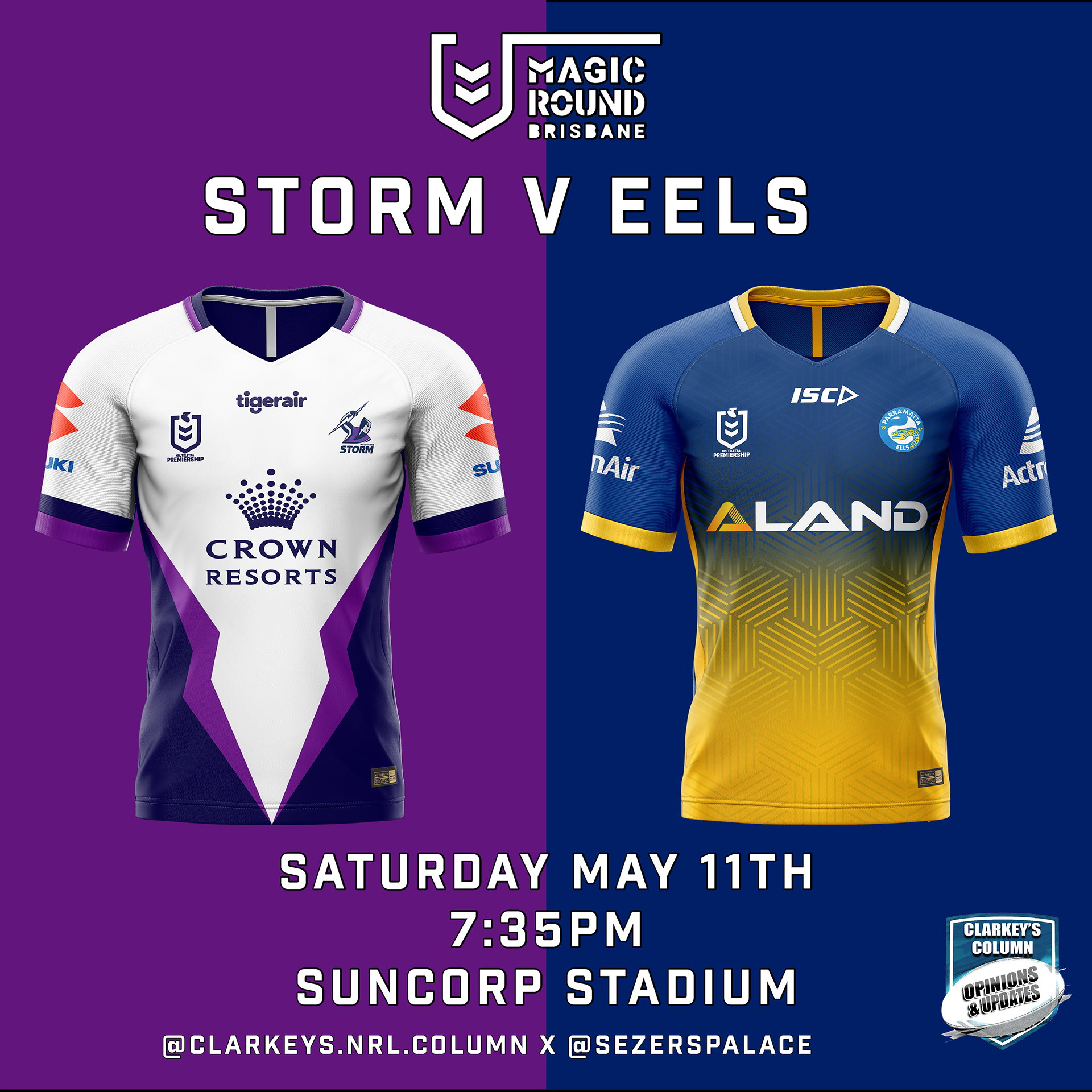
Storm: Melbourne have had historically bad Alternate jerseys. With this jersey I wanted to have a crack at designing a visually appealing white Storm jersey.
Eels: Modern re-design of their classic 1980's jersey.
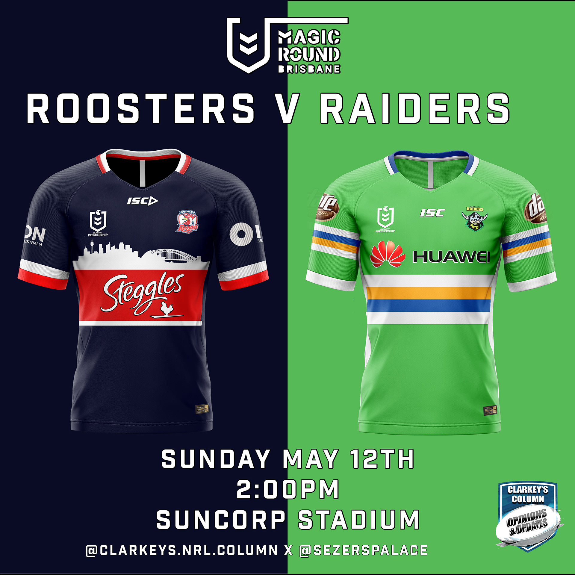
Roosters: Sydney skyline silhouette. Inspiration taken from Dallas Mavericks NBA Alternate jerseys.
Raiders: Inspiration taken from 2014 Raiders 'Legacy' jersey. 2019 colour scheme implemented.
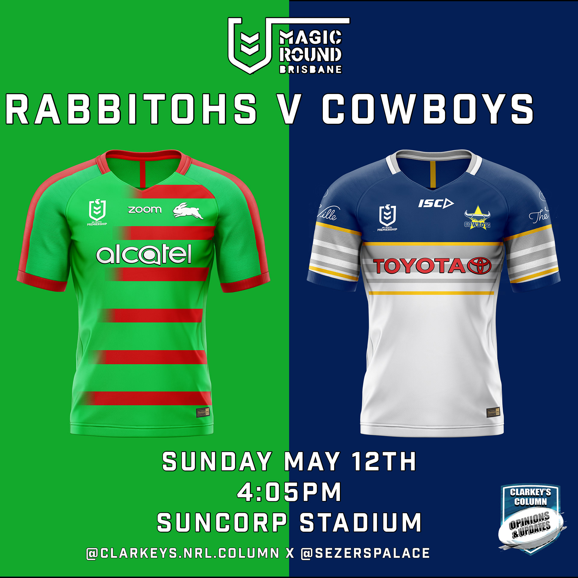
Rabbitohs: Influenced by 1970's Smiths Crisps jersey as well as current USMNT Soccer jersey.
Cowboys: 1995 Throwback. Should be the permanent Cowboys home.